H2O Capsule
Branding, Packaging, Print
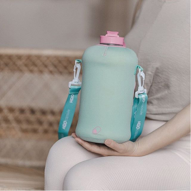
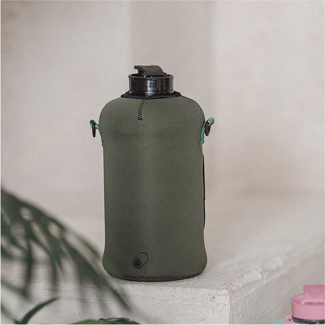
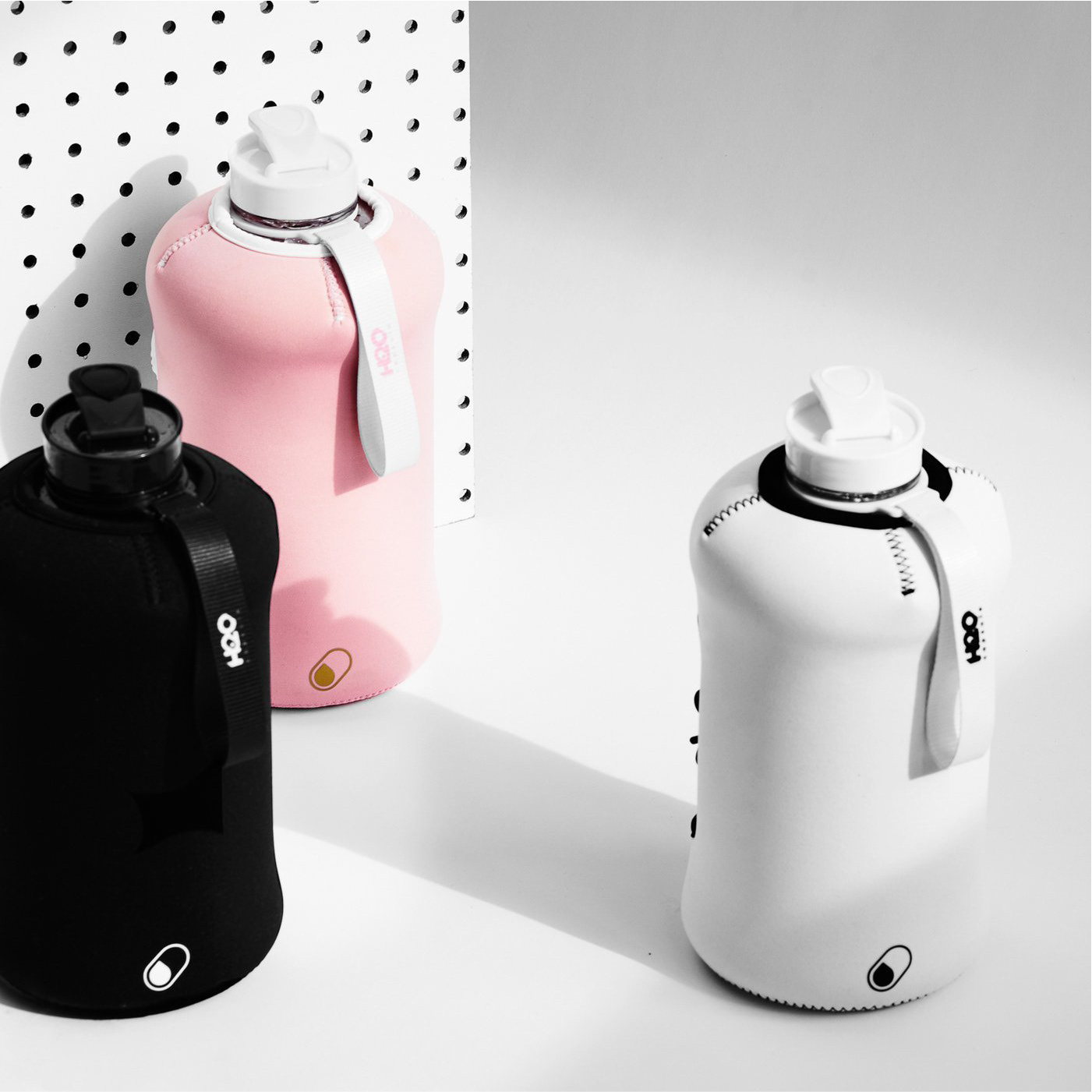
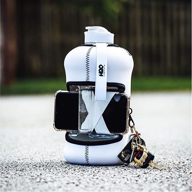
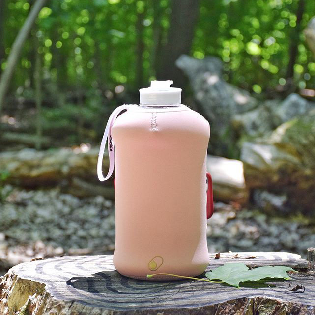
Born out of their own experiences in the gym H2O Capsule, a startup, patented a first of its kind 2.2L water bottle sleeve that holds your personal belongings – phone, cards and keys. They came to me initially in search for a fresh, stylish and trendy look to their brand which included designing a logo for the startup, sleeve and package for the bottle. Since then I have designed 9 new patterns for their packages, bottle hangers, social media assets, banners and table throws for them.
01 The Goal
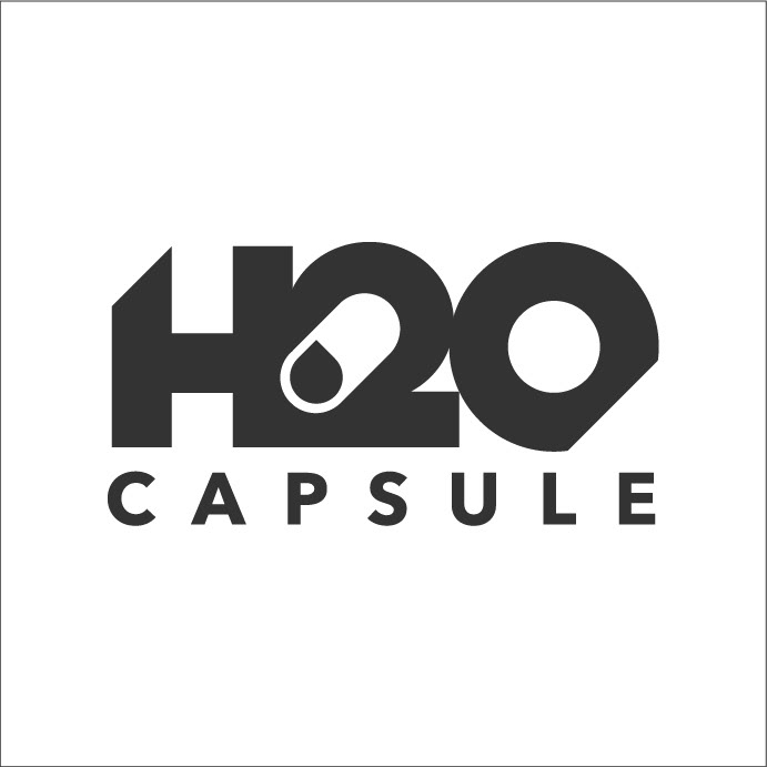
The goal for the logo was to create something fun, trendy, modern and bold that includes an element to it that can be used throughout brand materials and platforms. As soon as I put pen to paper I was already taking advantage of the name itself by combining the elements of H2O (water) + capsule.
02 The Problem
The only issues I would say I had with the ideation phase was not being able to break out of the mold of those 2 elements which is evident in every one of my concepts.
03 The Result
The final result – I landed on using the negative space between the “H” and the “2” to serve as the shape of the capsule and nested the water droplet inside of that. After that I shaved off the top left corner and the bottom right corner of the logo to give it a slightly edgy look but kept all the tips rounded. The final product provides an identity that is easily readable, bold, recognizable, identifiable, trendy and fun. In addition, elements within the logo can serve as an identity across various platforms/mediums.
Packaging
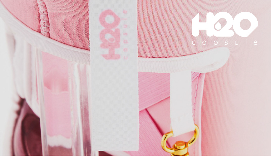
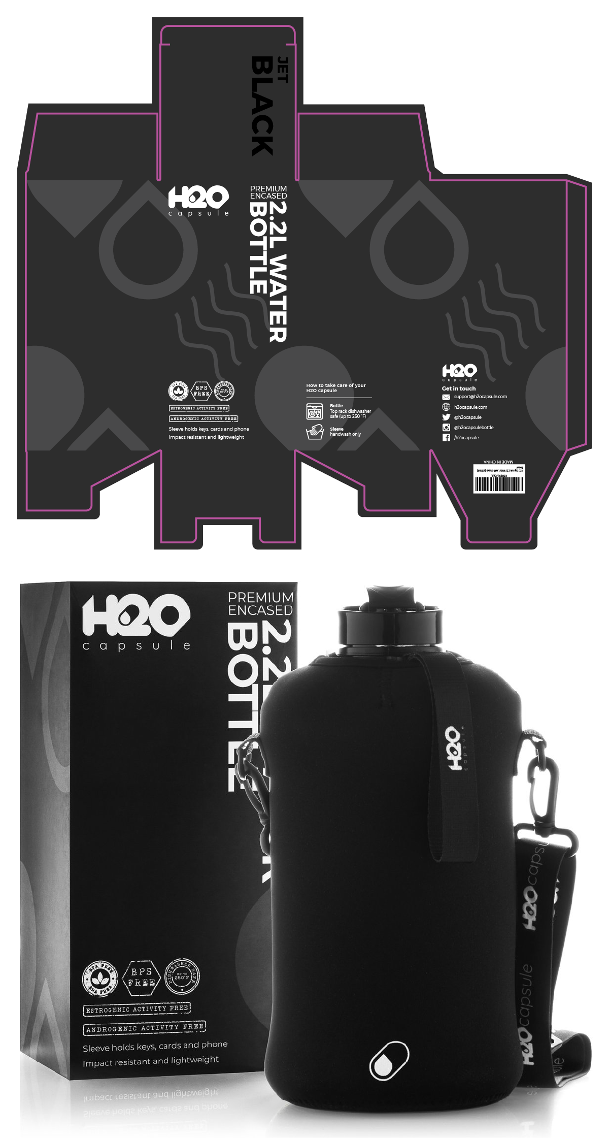
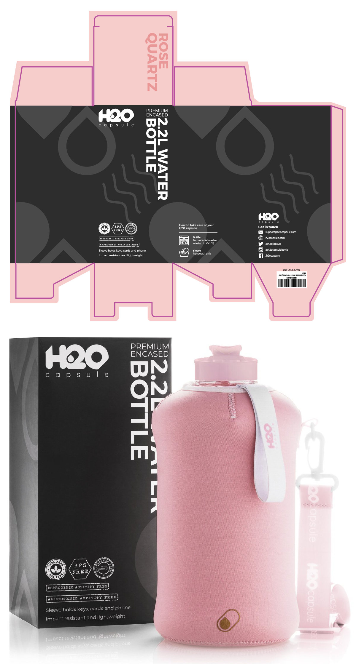
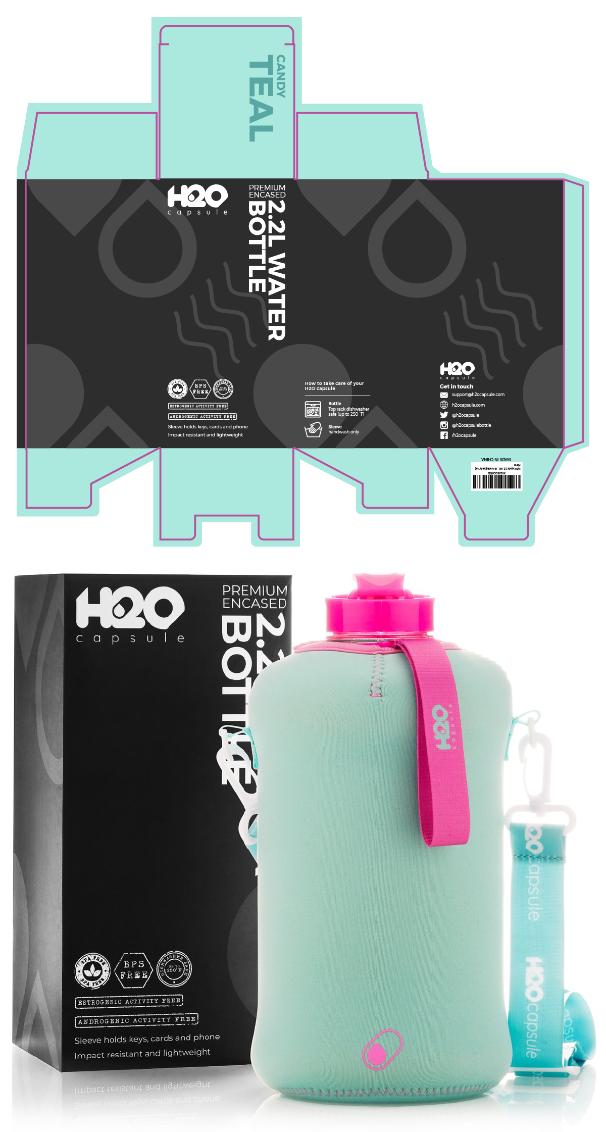
After the creation of H2O Capsule’s logo I now had some brand elements to work with in creating a fun and artsy pattern for the packages – brand elements such as the water capsule icon within the logo itself. I used this as the foundation of the pattern on the first three packages, and in an additional three after that. Four new patterns were created for the remaining packages which totals to ten and counting. For the sleeves they initially wanted the patterns reflected on there as well but we collectively ended up with solid colours which is also represented on the tops of every package. This proved to be the best approach in giving the sleeves themselves a nice clean, sleek, modern look.
Social Media
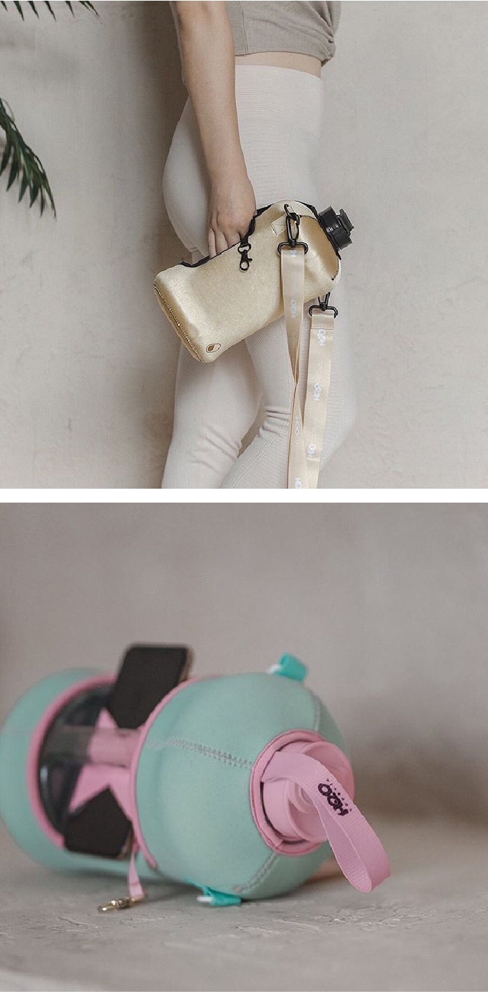
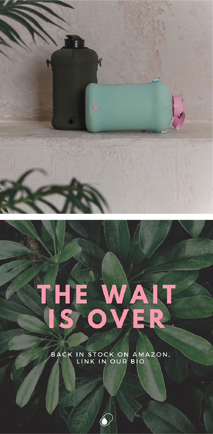
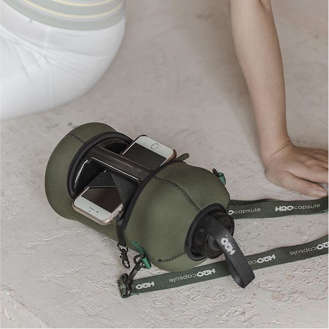

Banners
H2O Capsule needed some banners designed for the 2020 FitExpo at the Los Angeles Convention Center. The banner was initially requested to have a black background, be clean and minimalistic. Provided the details I thought it was quite straight forward so I made a choice of pushing some boundaries by clipping images to the brand pattern as-well as creating a white version – they didn’t think white would’ve stood out as much or it would’ve been too boring. In the end they loved all of them and in particular the first one on t he left and the last one on the right.
